Monday, April 18, 2011

Premier of Saskatoon Fashion Week

After my show for Vancouver Fashion Week, last Thursday, I received the greatest compliment - I was invited by the creative director of the soon to debut, Saskatoon Fashion Week, to show at SFW's launch next August!

I can't believe how lucky I am; what an amazing opportunity.  I'm very excited by the prospect of being involved in the PREMIER of this event - I keep thinking of how much exposure I could possibly receive by being a part of something so new to the Canadian fashion scene.

So, cross your fingers for me my lovelies and hopefully I'll be jetting off to Sask. in August!


Hang Tag

For a digital illustration class, we had to develop and create merchandising/marketing materials for our brand.  I've been doing a lot of thinking about branding and what the lifestyle of my target market is, what images and characteristics that I would like to associate with my brand and are these things that appeal to my target market?

I started with gold - I'm a sucker for gold bling and I feel like it embodies both qualities of luxury and kitsch; two juxtaposing elements that are present in my designs.  I also think that a general theme that runs through my designs is the sense of the garments being unique, yet quite wearable - gold is a precious material that, when you consider only items made from a pure form of gold, is not as prevalent in the market as say, silver or even gold plate/vermeil; yet it is very easy to incorporate into a wardrobe.

Next, a pony because of the feminine and masculine qualities that it represents.  Some little girls have soft, ethereal dreams of riding a horse through the mist on a beach; and the lean musculature of a horse can certainly be related to a lean, chiseled male physique.  Many of my designs incorporate elements of soft draping and structured, tailored silhouettes, so finding an image that also had "soft" and "hard" qualities was essential.

Using Adobe Illustrator, I found an image of a carousel horse that I liked, traced it and tweaked a few aesthetics - curved the tail upwards to give a sense of movement, removed the saddle and draped a riding blanket over the back with my logo on it; I was trying to keep the incorporation of my logo simple as the rest of the illustration was fairly detailed.

Then, I outlined the entire tracing and filled the outline with a gradient of dark browns, golds and creams.  After I had the "shine" pattern that I wanted, I played around with some different effects, like glass, crystalize, ink outlines, and paint daubs, and finally, I used Shape Builder to draw an extended outline that included a tab for a hang string.

Now, where can I have these printed and cut without being charged an arm and a leg...?

Saturday, April 16, 2011

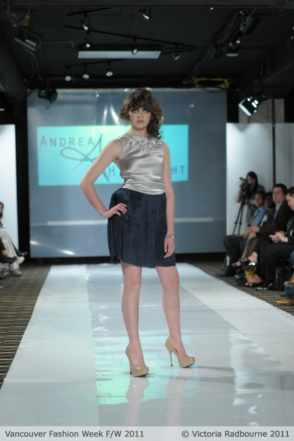
Vancouver Fashion Week


As I implied with my last post, I showed my new F/W '11 collection at Vancouver Fashion Week this April!  The collection is inspired by driftwood and the shapes and movement that it embodies, along with the element of erosion, as that is how driftwood is formed.

I've used a lot of draping and smocking to mimic the smooth, flowing lines that are seen in driftwood; the smocking is meant to appear as root structures and knots.  I rely a lot on juxtaposition in my designs, and what I found interesting about driftwood, was the way water and sand slowly shapes the wood into these smooth, sloping shapes - there is a sense of movement, fluidity given to the rigid wood through the erosion of its surface.  I also thought this erosion process was much like the way people change through each experience of their lives.  With each triumph, downfall, love and heartbreak we learn and reform ourselves and the parts of us that are not authentic are eroded away.

Thanks to Daniel Jolly and Victoria Radbourne for the fantastic photos!


Monday, March 28, 2011

Guilty Pleasure...

Those of you that know me are probably painfully aware of how "into" Star Trek TNG I am, so this will hopefully make you giggle and/or hang your head in empathetic humiliation for me...

As I'm showing at Vancouver fashion week this April (April 14th '11, come see yours truly and other emerging designers including my fabulous friend, Wilber Tellez!), I was asked to participate in a "Styling Tips" feature that The Province was going to be running.  I was so excited to be asked, that I enthusiastically replied "YES!!" before really knowing what it was...  Turns out it's a short, constructive critique of Vancouver street fashion by VFW designers.  That's pretty cool, no?  Anyways, VFW sent me the pics prior to the interview happening the next day, so I could come prepared with a little spiel, gave me a time to show up at The Province building and wished me luck!

The outfits were, in my opinion, very typically "Vancouver."  I wrote down some notes that morning, had a mini freak out about the media attention (ok, maybe a fairly large freak out, I mean, they needed pics from my most recent collection, head shot, basically everything that a designer who takes themselves seriously has, and I hadn't thought to put those things together!), and spent an extra couple of minutes on my hair since, who knows, maybe they're taking pictures while talking to me...

Well, turns out it's a video interview and it was going to be run online next week.  I spent the 2 minutes in the elevator up to the studio silently giving thanks to the powers in charge of all things hair, for getting me to plug in the flat iron that morning and remember to pack my umbrella.  The woman who is interviewing me, Dana, calms my nerves quickly and starts in with easy questions like, "What is your spring must-have?" and, "Where do you find inspiration for your collections?"  I talk about shoes and nature and science and Star Trek...  STAR TREK.  Am I the nerdliest of nerdlies?  Well, I'm not alone (thank god), the gentleman behind the camera is a fan too.  Phew.   I'm asked more about the outfits I'm critiquing, blah blah blah, ok, now to wrap up.  I'm feelin' all good, that was easier than I thought, heh, I could maybe do that again if need be...  Oh, what's this? The two of them have a great and secret closing question to ask me?  And is she asking me what costumes on Star Trek I would re-design if I could??  Yes, yes she is.  And I blatter on, not only about re-designing costumes for the Borg, but about re-designing the whole Borg character!  What am I talking about?  Why did I choose that character?  Why not the "dress uniform" that is SO ugly!  I mean they look like weird, girly, gold piped tunics...

There I go again.  I'm mortified and hang my head, embarrassed - Darmok flushed at Tanagra.

Check out DGTV at The Province, for my nerdtastic debut.  Thankfully, they cut the most mortifying parts...

Sunday, March 20, 2011

Texture & Movement

 I've been really inspired by textures lately, finding myself wishing for Jedi-like skills with knitting needles, but alas, I have yet to refine my knitting past plain and purl.

This piece from the Mark Fast A/W 2011 collection is incredible - I think it's very innovative in the way it uses flat knit panels to create a deep and mutable silhouette.  So many things go through my mind when I look at this sweater - clothing as protection (armor), Newton's third law (for every action there is an equal and opposite reaction), how flat pattern drafting results in a 3-dimensional garment...  I think I'm most fascinated with the interaction between the panels and how that influences the surface of the garment.  Obviously with every piece of clothing there is a relationship between the body's movement and the movement of the fabric, but Mark Fast illustrates this relationship in a comprehensive and unique way .  Instead of just having creases form in the crook of a bent elbow as you would experience with a flat material, this garment also shows the resulting expansion of the material along the outer bend of the elbow. 

I'm not really sure why I find this so worthy of recognition; possibly because I think it is a good representation of how interconnected everything (and I mean everything) is; or that it shows how something is more valuable as a whole than the sum of its parts, or it could just remind me of my childhood dreams of having a suit made of corrugated duct like a robot.

Thursday, December 23, 2010

Phi Collection


So, I originally intended to do all of my illustrations in a digital format in order to keep with my theme of using technology as a visual and emotional language; however, i found that it took almost 4 times the amount of time that it would have taken me just using paper and pencil...  Which I find ironic since we are led to believe that technology has been developed to make tasks more simple or more efficient...

Anyhow, I only finished 3 of the illustrations in complete digital form and the rest are in quick sketch form.  My process had me first try and form a collection by designing each look separately, which did not yield a very cohesive collection.  After learning Drew's technique of plotting where on the body the collection is going to fall/cut/have detail, and putting the elements of my designs into the body map, the whole thing started to look more like a collection and less like someone's closet blew up.

After that, I went on to scan some of my croquis into Photoshop and Illustrator and started to draw faces.  I wanted the faces to feel soft and demure, fluid and pretty, like the gauzy material I used in the drapes of the collection.

Then I started to draw the outline of each look in Illustrator, to then transfer it into photoshop for colouring, shading etc.


The technicals I did are for the look that included the top that I draped, and the shirt skirt combo with the origami hip detail.

Wednesday, December 15, 2010

Phi - Illustration

I've decided to do my illustrations for Phi in a digital format to further reflect the integration of technology in society; however I've kept the drawings fairly natural in the face (as opposed to going with a "tech" style of illustration), to juxtapose the digital aspect...

Wednesday, December 8, 2010

Details - Shopping Trip

Phi is about defining the abstract concept of beauty through the use of mathematics and sacred geometry.  I think Phi will use a combination of smart textiles (such as conductive fibers, ThermoChromic inks) and natural fibers to further communicate my feelings about the deep integration of technology in society.  The palette will be fairly natural as a way to again, communicate the way technology is integrated into society, with the addition of gold, as Phi is considered the "golden number".  I would really like to incorporate some laser cutting into my designs because I think the way the technology cuts so that it appears or feels like the design is part of the fabric, is in line with my concept.


I also really like the idea of printing onto a sheer, nude fabric so that the printed pattern looks like it is part of your skin.  I think printing geometric shapes or a fibonacci spiral onto a sheer nude would be neat.  The shapes printed would mimic the shapes found in the body figure - triangle drawn from shoulders to waist, thin curved waves around the ribs...  further communicating how sacred geometry is so prevalent in our everyday lives, yet we don't necessarily notice or acknowledge it. 


I would like to see some softly shaped, origami details, juxtaposed with harder, crisply shaped origami.  The softer shapes would be alluding to the more abstract concept of origami, much like I am trying to communicate that there is a "formula" of sorts, to beauty.
As for seam finishes, I'd like to use french seams on the woven fabrics that are natural because it would then feel as though the fabrics were growing out of themselves into the shapes of the garments. with the Tech fabrics, I would like to see either raw edges or fabric welding, so once again, the fabric looks as though it is formed together as one.

Production would be in Greece because that is the origin of sacred geometry and Phi and so shall it be the origin of the Phi collection.  Unfortunately, production in Greece would probably be much more expensive than it would be to have this collection produced in China; however, as Greece is suffering from economic downturn, it may be possible to get a better price than it would be in a time of economic growth.  Production in Greece will affect the price point of this collection, as will the materials used.  Based on current pieces in the market, Phi will probably be priced at $300 - $800 for a top, bottoms from $500 - $900, dresses from $1000 - $3000, jackets from $2000 - $5000.

The market is looking for high end, statement pieces.  Currently, I think Balenciaga is the market leader and has saturated the market with very tech looking, structured pieces that focus on the technology of the textiles as well as the intricate pattern drafting.  I would like to have a similar approach with the thought and development behind the textiles, but with more balance between hard and soft shapes, i.e. more draping than traditionally seen at Balenciaga.


One concept that has been explored by a Berlin based design team, is using a computer program to map the body, convert the body contours into hard, geometric shapes and use those shapes as patterns to construct clothing : http://www.dezeen.com/2008/09/29/the-t-shirt-issue-by-mashallah-design-linda-kostowski/

These products pertain to my market as they are looking for their clothing to have more of a personality than just to function as cover.  My market itself, is interested in having the technology behind their clothing featured as having an aesthetic value and being showcased rather than it being a silent quality.  They probably work in a field where their position is integral, yet, their work isn't necessarily easy to spot in the finished product.


Friday, November 26, 2010

Mood Board


 I mapped out a few of the shapes that I found when examining the images. The images with the most aesthetically pleasing angles and shapes were the ones I used.
 Some of the images were arranged on the board to create relationships between themselves through geometry as at a glance, they may not appear to be related.  I thought this was a good way to translate the purpose of Phi as it is a ratio that can be used to relate somewhat dissimilar elements of geometry.

 I would like to use this gold spiral in a print.  I think it would look amazing sweeping across the body, up, over and around the shoulders...
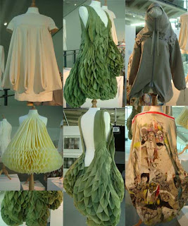
 The tassels represent the golden section that is related to Phi.  When a segment in divided into parts that are 1.618 times longer than the last.

I chose a lot of pictures that had either an organic shape or very hard geometric lines to stay within the theme of the sacred geometry of Phi.  I put a clear sheet of plastic over top so I could get the effect of a white board when I mapped out the geometric shapes, so it was a little hard to get up close for detail shots without a blinding flash light.  Essentially the board connects some of the geometric associations that I tried to make when setting up the board, which I think is much like Phi - it connects elements of sacred geometry that were not connected prior to defining Phi.

Mainly the board focuses on structured shapes that have a swooping/spiraling paths; I've used gold in some of the notions and images to allude to the "golden ratio" that Phi is also known as.  Some of my favourite images are the organic origami ones - they look like insects from the future...

I can't wait to start designing for this collection, I think it's going to be a real challenge to juxtapose the organic and the mathematical elements so the separates work within each other and they don't look too dissimilar and more like two collections styled together...

Monday, November 15, 2010

Phi= Beauty


In my last couple of posts, and in responding to some comments, I believe I have a) found my visual language; b) narrowed my focus; and c) renamed my collection.

Phi (the Greek letter above) in mathematics is the Golden Ratio.  Several studies have been done to determine what the majority of us find to be "beautiful" and most conclude that the most "beautiful" subjects' proportions relate to each other by the value of (1.618...).  I am also personally of the opinion that beauty is best achieved when there is proportional balance between elements.  In one response to a comment, I said that I was mainly interested in relating finite concepts (such as math and science), to more abstract and infinite concepts (like beauty and love and humor) and I think that might be the way to do that...


I was first thinking that this may be too far off from my original concept of technology being deeply integrated into society, but after some thought, I liken the idea of defining beauty by way of , as somewhat of an ultra lo-mo proof commenting on the level of integration of technology in society.


I'm thinking of garments cut so that all the bottoms use 1.618 time more fabric than the tops in the collection; or any paneling done is proportioned with ratios...

Gotta re-work my inspiration board...!